Wednesday 16 March 2016

Blog 7 – SVG Evaluation

Out of both the projects I believe that this was the most difficult. Coding SVG’s I found was a little tricky because depending on the version of Illustrator you own, the exported code will be different.

The aim of this project was to create an SVG using animation and audio. But from experimenting with audio, I found that an audio aspect to my logo did not fit the purpose of this product. I experimented by adding an audio clip to my logo on hover over. I began to find this very irritating because the audio clip would trigger when scrolling and other glitches. I did not fully achieve my aim but I believe I should have done more research on implementing audio to SVG’s before I wrote this as a requirement for my assignment. I believe that this will help me in the long run because I understand now the difficulties using audio in SVG’s. I experienced something similar to this by using audio in Adobe Flash.

The biggest objective to this project was researching the coding/editing of an SVG. I did not have an issue designing the logo in illustrator because of my existing knowledge, but I however found the coding aspect a little complicated. I mentioned before that I began researching and looking at tutorials online to see how to exactly edit the coding of an SVG using CSS, but because my version of illustrator was different, I had to do extended research. I found it really hard to find examples of people coding SVG’s similar to my coding, but I got around this by using the SVG optimizer. This tool really helped as it changed my code to look similar to what I had been researching beforehand.
The demonstrator for my SVG shows that I can export graphics created in illustrator into a fully editable graphic using CSS and HTML. Although I did not add audio to my graphic, I did add animation to the SVG. The animation on the SVG is on a continuous loop and can easily be changed with the knowledge acquired. I have also shown that I have knowledge of changing something like the colour fill of graphic, without having to go into illustrator and spend time editing there.

Overall I believe I could have done a lot more with this product given more time to research and test different methods. I believe that I will be experimenting with SVG’s in the future after this project because I am very interested in the possibilities. After looking at more examples online, my goal is to create an animated graphic/comic for my portfolio. This project helped me identify an aspect of design that I had previously had no knowledge of before, and with the experience gained in this project, I will push myself to create bigger and better products in the future.


Blog 6 - Creating an SVG!

For my second self-initiated project, I wanted to really challenge my design and coding skills. Before this project, I began researching what I could research and learn, and one thing that really stood out was SVG’s. I have knowledge with vector graphics by creating graphics and illustrations in illustrator and flash, but had no knowledge of SVG’s. After doing some research and listening to what some professional designers were saying, they argued that all logos on sites should be SVG’s. After doing some research, I learnt you could do so much with SVG’s, like animating sections of a design and even adding sound. I was really intrigued so I began looking at examples people were creating and started off there.

I wanted to create another logo for myself by using my initials ‘DRE’. I have always wanted to use my initials to create a logo, so I thought I would try it out with an SVG.

I first began searching online for tutorials to get a feel and more understanding of what an SVG actually was. I soon found out that SVG’s were basically a coded graphic using numeric data and basic styling. This was a little of a shock to me because I went in thinking that all my time would be spent designing my SVG instead of coding, was I wrong. After a few tutorials on Lynda, Treehouse and Youtube, I began experimenting with creating a design that could be animated.

I started with basic shapes to begin with and trying not to bite off more than I could chew. I chose the turquoise blue I used a lot on my website and incorporated it into an oval shape with my initials. I didn’t have too much trouble creating the design in illustrator as I have used it before and believe I have grasp of the tools.

The biggest problem I had with this project was the coding. I quickly realized that the coding of my SVG after I had exported it was completely different to the tutorials I had been looking at previously. I tried to code the SVG by defining classes but this only broke the image. I overcame this problem by doing more research on the web for more up to date instructions. I simply found the information I was looking for by specifying what version of Illustrator I was using. The biggest problem solver for my coding problem was a website called SVGOMG by Jake Archibald. This simple website takes SVG coding and removes all unnecessary lines of code to make editing the code much easier. With this code optimizer, it made editing my code much easier and clearer.


Finally encoding the SVG into my site wasn’t too difficult because for the most part it was exactly the same as adding an image was a simple image tag. 
I animated my SVG by simply adding an animate transform tagging and customized it to my preference. Finally the SVG was uploaded to my website header in replacement of my old logo design.


Resources used:


Blog 5 - Time-lapse/WebM Evaluation

The aim of my first self-initiated project was simple, to learn how to create a time-lapse and export it as a WebM for my portfolio to broaden my knowledge. I believe I achieved this aim because after much research and trial and error, I believe I have a better understanding of the subject. Before this project I didn’t know that to achieve a time-lapse with a DSLR camera, you needed a remote. Not only did this remote help me complete the project’s demonstrator, but it also gave me the ability to record time-lapses for other projects outside of university.

The objectives for this project were followed very thoroughly, without research on time-lapses and equipment, I wouldn’t have known about the remote needed. Other than the remote, all of the equipment needed for this demonstrator had already been acquired. In the past I have had bad experiences borrowing equipment from the university due to the time allowed to book a DSLR camera. With my own equipment, I was able to be more flexible and experiment with what I wanted to record (sunrises and sunsets).

Researching how to export the raw video into a WebM was somewhat of a challenge. There are many different methods of exporting video into this file format. I achieved this objective by finding the right program for me that solved the file-size problem. Without this research, this part of the project would have been delayed. I went far beyond what I originally had planned for this part of the project, initially I was only going to find one website/program and export my video as a WebM. Because I spent more time with research, I avoided problems I would have encountered if I wouldn’t have done more research on this area.

The final objective for this project was achieved, but I found this to be the most difficult. Because I hadn’t done the amount of research I needed to and underestimated this part of the project, it delayed my performance of adding the WebM I had created to the portfolio website. The objective was achieved but I believe I could have done a better job given extra time to test and do more research in this area. I wouldn’t consider my coding skills to be great so it is an area I really need to improve on in the future.

My demonstrator for this project demonstrates my ability to use my skills and combine them to make an impressive product that showcases my ability. The demonstrator first and foremost shows my ability to not just learn one skill such as the time-lapse, but to take it much further. My plan for this project was to just do a time-lapse, but after doing research on WebM’s, I really wanted to test myself and combine them both. Overall I believe the demonstrator for my time-lapse WebM really shows how innovative and eagerness to learn something new I can really be.


Tuesday 15 March 2016

Blog 3 - Improvements to my portfolio website

This blog post is about how I improved my website using the feedback from my tutors. Examples of my improvements will be illustrated using images, please click the images to make them larger.

A few of the smaller improvements to my website were making the logos on my website clickable so that they took the user the back to the top of my website. In my footer I have my logo, I simply made the small logo a link which took the user to the top of the page. 


This made the user experience of my website better because users wouldn't have to scroll back to the top of my website.

The next improvement I made was make the link to my CV stand out more. First the link to my CV was a text link saying ‘here’, this was a bad decision because it didn’t stand out and it was hard for users to see. So I the improvement I made was to create a simple image link.

The biggest improvement I had to make to my site was my blog. Originally the only link to my blog was in my navigation bar. This may sound like small negative point but in terms of accessibility and user experience, I needed to make a blog section on my website.
So I creating a blog section to my website and added a paragraph telling the user, clicking the links below will take them to an external website (Blogger). This paragraph just simply gives the user a warning before the click it and be taken to a different website.


What I also did for user experience, I added a link to go back to my website at the bottom of all my blog entries.

Another small improvement to my website was the headers in my contact page. The line spacing on this header is a little hard to read on other devices, so I simply removed the line spacing.


One of the improvements I completely overlooked was my contact form. I did not have text above my message box asking the user to write a message. What I wanted was placeholder text in the message box simply saying ‘please write your message here’ but I couldn’t get the coding right. So a simple work around this problem was to add a line of text above the message box.


All of these small improvements were made to make the accessibility and user experience the best I could possibly achieve. What’s the most important thing is to get eyes on my website, and everything be readable and accessible. Because I’m not a very good coder or web developer, I would like to make my website more adaptable on other devices. In the future I will learn more and teach myself about responsive and make my website not only accessible on all platforms, but the design be consistent.


Blog 4 - How I made a time-lapse and made it into a WebM

This blog post is a little different, I will be detailing how I learnt how to film a time-lapse, learn about WebM’s and how to convert my time-lapse into a WebM. The reason why I chose to do WebM’s as my first self-initiated project was because of my instant interest in them. My knowledge of WebM’s were quite basic, I thought WebM’s were a video format (which I later learnt it really isn’t). WebM’s are the new kid on the block when it comes to video formats on the web. Because WebM’s are new, you don’t really see them on websites that much. You may come across them every once and a while, most commonly on image boards. After getting stuck in and searching the web for articles on WebM and the legal troubles they currently having, browser support and alternatives, I was determined to learn how to create one to use on my site.

Time-lapses were a different story. My knowledge of time-lapse was just from an audience member, nothing technical. I have always wanted to learn how to make one, now that I own my own equipment (camera, lenses and tripod etc. But what I didn’t know is that I needed a digital timer remote. Without this remote, filming a time-lapse with my camera wouldn’t have been possible. Because I have an older version of the Cannon (700D), I didn’t get the time-lapse feature that the newer models have. I got around this problem by going online and purchasing a cheap digital timer remote. After doing some research, most digital timer remotes pretty much operate the same; some paying extra for a branded remote was pointless.
The filming of the time-lapse was a little tricky. I wouldn’t call myself an expert with my camera, I’m still learning so I had to look online for tips on how to actually film a time-lapse. The process was quite simple; all I needed to do was with my new timer remote, set the remote to take an image at the time I set it. Because I was filming for a few hours, I set my camera to take a picture every 10 seconds for roughly 6 hours. After fearing the weather turning bad and raining, I produced a very nicely made time-lapse of clouds forming. I will add a link to the raw footage bellow.

Finally it was time to export my video as a WebM. I first went into this thinking it would be much harder than it actually was. After searching online for the best way to convert MP4 into WebM, the response was to use a converter. The problem I found was to find a converter that I could export the WebM at an exact resolution. After some searching I found a WebM converter called ‘WebMBro’ that could do the job. This converter was created for beginners, so this was perfect for me. It was then as simple as choosing the input (the raw MP4 video file), choosing the resolution and convert.

Finally embedding the WebM into my website was very simple; I just coded the WebM like I would do an image with a simple image source code in HTML.


Here are a list of resources I used:


Wednesday 18 November 2015

Blog 2 - Researching, designing and creating my portfolio


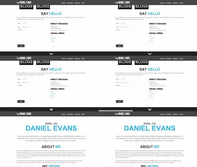
As part of my Agency Ready unit I have been asked to explain my techniques used to research, design, build and launch my new portfolio website as part of my assignment. I will discuss the decisions and choices I made during the processes of making my website. Before making anything or thinking of the design of my portfolio, I needed to decide what is the purpose of my website. Because I am a digital media student, I decided to focus on my videos and my art. Because I have videos on Youtube and on an art website called Wysp, I had to make sure my is a central hub for my social media and previous work. Before I began my research I decided I wanted to make my website a one page layout with a simple design that would work on other devices on the future. I began researching one page portfolio sites online and stumbled on a bunch of good websites like onepagemania. The common theme I loved about these examples were the header/navigation that seems to be a common theme with one page websites. What I also really liked is how people when designing would section off parts off their website with large headers. I really wanted to implement this into the design of my website because I thought it would make my sight simple, slick and easy to use. Before I began coding anything, I decided I wanted to design my website in Photoshop first. This would give me a good feeling of where my content would be, and also how big they needed to be. So I first created my Photoshop document in the size of a standard monitor resolution (1425 x 1776). I began experimenting with the integrated header and navigation bar at the top of my website, and would be visible when scrolling down my website. I first made my logo and navigation to the far left and right of the page, but then I decided it didn’t look right and made it the same width of my content (roughly 900px). After designing the layout of my website, I showed the design to my friends and classmates and changed a few things around, mainly the sizes of my headers and images. The feedback for my website were mainly positive, they liked the design of my website and thought it was very nice and easy to use. The most important thing in making my website is that it is simple, easy to use and has working links to my work. Then it came to my actually coding my website. I found it quite difficult when I got around to coding my website, but I did find it very helpful that I designed the website in Photoshop first. This let me know exactly how big everything needed to be on my website, so it made coding the CSS a lot easier. Because I find coding sometimes difficult, I made it easier to use sources online like Treehouse to learn how to code parts of my site. The thing I really learnt when making this site was how to make my code easy to read for myself, because I would reach the point where I didn't know what part was what or where a div tag for example started and ended. I took full advantage of the comment tool in HTML and made it easy for myself to section off parts of my website to easily code style in CSS. Overall I thought I did a good job with my website. It’s obviously not as flashy as some of the sites I have seen from my peers but I really like the design and experience of my site. I will not be going into the web industry as a career but this website will help as a central hub for all my social media and web presence. I intend to update my portfolio with more work I've done because I want to keep my website update for future opportunities from employers. What I've learnt from this project is that making a draft version of your website in Photoshop helps bring your idea to life.


Tuesday 17 November 2015

Blog 1 - Responsive Report by Gridset


As part of my Agency Ready unit I have been asked to read the Responsive Report by Gridset. The report gathers results from people from different types of roles in organisations within the web industry and their opinions on responsive website design. These results are the positives and struggles with responsive website design based on specific key points. I have been asked to reflect on what I picked up from this report and the resources, how I feel about it and if there are any problems with the report.

The first thing I found quite interesting about the report was the different types of organisations involved in the report. For example, project managers was a surprise to see because it shows that responsive design is so becoming important in today's web industry, different roles are taking a role in responsive design. In addition, project managers, businesses managers are also taking a big role in responsive design because a website for a business is very important because of business revenue and potential clients visiting the website on different devices.

A positive and negative part of the report is the amount of people that have answered the survey. Although the number of people from different roles in organisations have doubled since the last report, one could say that just having a little over a thousand people answering the survey is just a small percentage of the number of people there are in the web industry.

One of the biggest challenges with responsive design based on the report and what seems to be a recurring theme in the gridset report is optimization and the speed. Personally working on image optimisation with the web, this seems like a problem that comes up a lot with not just responsive design, but website development. I believe that this is just an issue to do with more with internet speed (wifi and mobile data) and not to do with the actual images. One of the biggest concerns with the organisations in the report is Responsive Design needs to work on different platforms but also different connection speeds. The website Site Point and other websites seem to addresses this issue with responsive design and website speed. This website gives some good examples which I have tried with my small website and I saw a difference.
The feeling of the report generally is that responsive is difficult, but exciting. Each year there are more and more ways to do the so-called ‘right way’ in responsive design. Because every few years new technology comes out that makes not just responsive design change, but website development as a whole. To make it in the web industry you need to be a on top of the industry standard, and always be up to date with different standards and way of coding. In the report there is still feeling of frustration with the responses from the survey. Which makes me think if I’m finding frustrating from the beginner level, I can only imagine what the feeling would be if I was deeply involved in the web industry.

What I’ve learned from the report is that responsive design is very complicated and has a large community of people from different roles in organisations coming together to give their feedback and make responsive design improve. I personally enjoyed reading the report because I like to learn new things, but I have slowly realised that I don’t see myself in the web industry. The reason why I don’t see myself in this industry because slowly lost interested and found coding very difficult and for the most part frustrating. What I most enjoy is designing the websites I create and believe I would best suited as a designer and not a coder because of my background in graphic design, art and filmography. Before I first started university, I wanted to learn how to design and make professional for the web. But as I progressed into website development I found it frustrating because I felt that there are so many people out there who have been doing it less than I have but are still way more advanced than I am.