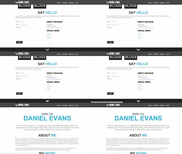
This made the user experience of my website better because users wouldn't have to scroll back to the top of my website.
The next improvement I made was make the link to my CV stand out more. First the link to my CV was a text link saying ‘here’, this was a bad decision because it didn’t stand out and it was hard for users to see. So I the improvement I made was to create a simple image link.

The biggest improvement I had to make to my site was my blog. Originally the only link to my blog was in my navigation bar. This may sound like small negative point but in terms of accessibility and user experience, I needed to make a blog section on my website.
So I creating a blog section to my website and added a paragraph telling the user, clicking the links below will take them to an external website (Blogger). This paragraph just simply gives the user a warning before the click it and be taken to a different website.

What I also did for user experience, I added a link to go back to my website at the bottom of all my blog entries.
Another small improvement to my website was the headers in my contact page. The line spacing on this header is a little hard to read on other devices, so I simply removed the line spacing.
One of the improvements I completely overlooked was my contact form. I did not have text above my message box asking the user to write a message. What I wanted was placeholder text in the message box simply saying ‘please write your message here’ but I couldn’t get the coding right. So a simple work around this problem was to add a line of text above the message box.
All of these small improvements were made to make the accessibility and user experience the best I could possibly achieve. What’s the most important thing is to get eyes on my website, and everything be readable and accessible. Because I’m not a very good coder or web developer, I would like to make my website more adaptable on other devices. In the future I will learn more and teach myself about responsive and make my website not only accessible on all platforms, but the design be consistent.


No comments:
Post a Comment